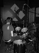
I like the typeface used here for the masthead. It's the colors that I am having trouble with. They're not distinct enough to where you see two different shades, they're that close together. For both directions (top and bottom pics). If you work with that some more, it'll really help the masthead. Really like the photography here as well. :) That drumset looks ready to go and smash...what cymbals are those? Been a while since I played drums.


I like the typeface used here for the masthead. It's the colors that I am having trouble with. They're not distinct enough to where you see two different shades, they're that close together. For both directions (top and bottom pics). If you work with that some more, it'll really help the masthead. Really like the photography here as well. :) That drumset looks ready to go and smash...what cymbals are those? Been a while since I played drums.
ReplyDeleteKeep pushin' bro!